BANKEREX
To create the Bankerex identity, we stuck to the base logo, but we wanted to give it more modernity and adapt it to the present, being a logo that conveys youth, simplicity and security.
The isotype has the same shape as the one used before but refined. We have removed the shading and the golden gradient, making it easier to use in digital and printed platforms.
We combined the navy blue color with the aqua color, playing with the contrast of the colors.


OPOSITAGESTIÓN
When designing the OpositaGestión logo, we focused on conveying professionalism and clarity. We chose a modern and legible typography to ensure that the company name is easily recognizable.
Sober colors, such as green and black, were selected to reflect confidence, innovation and seriousness. We incorporated the isotype with the OG initials to give more strength and visibility to the logo.
Every detail was thought out to make the logo not only aesthetically appealing, but also a true reflection of our commitment to our clients' success.


PIKY MORENO
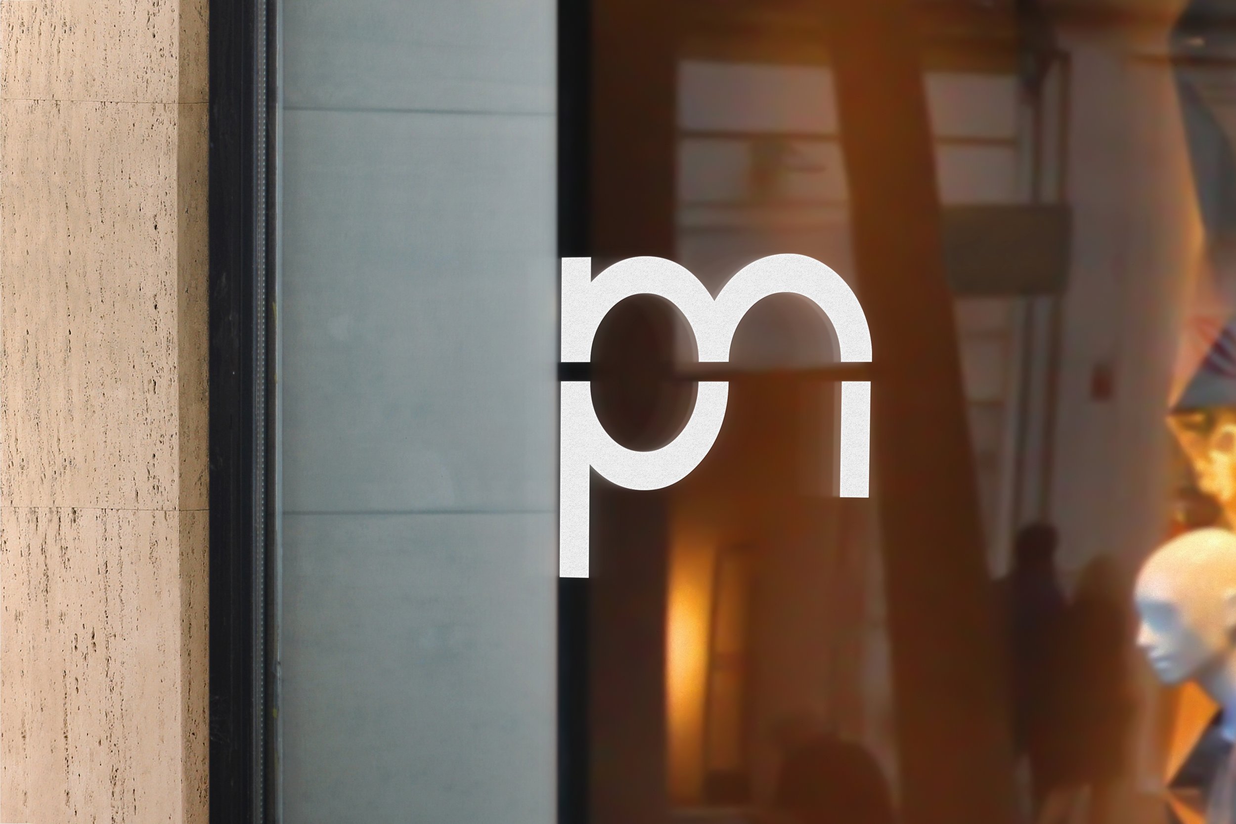
The PikyMoreno brand was born from a family project focused on the commercialization of clothing and accessories. We were inspired by the combination of the letters P and M, creating a unique identity that symbolizes our vision and creativity.
Our branding focuses on innovative and bold designs that stand out for their quality and distinctive style. PikyMoreno is positioned as a modern and dynamic brand, always at the forefront of fashion trends.
Each piece we offer reflects our commitment to excellence and our passion for fashion, strengthening the connection with our customers and allowing them to express their identity with confidence and elegance.


SANTAMARÍA
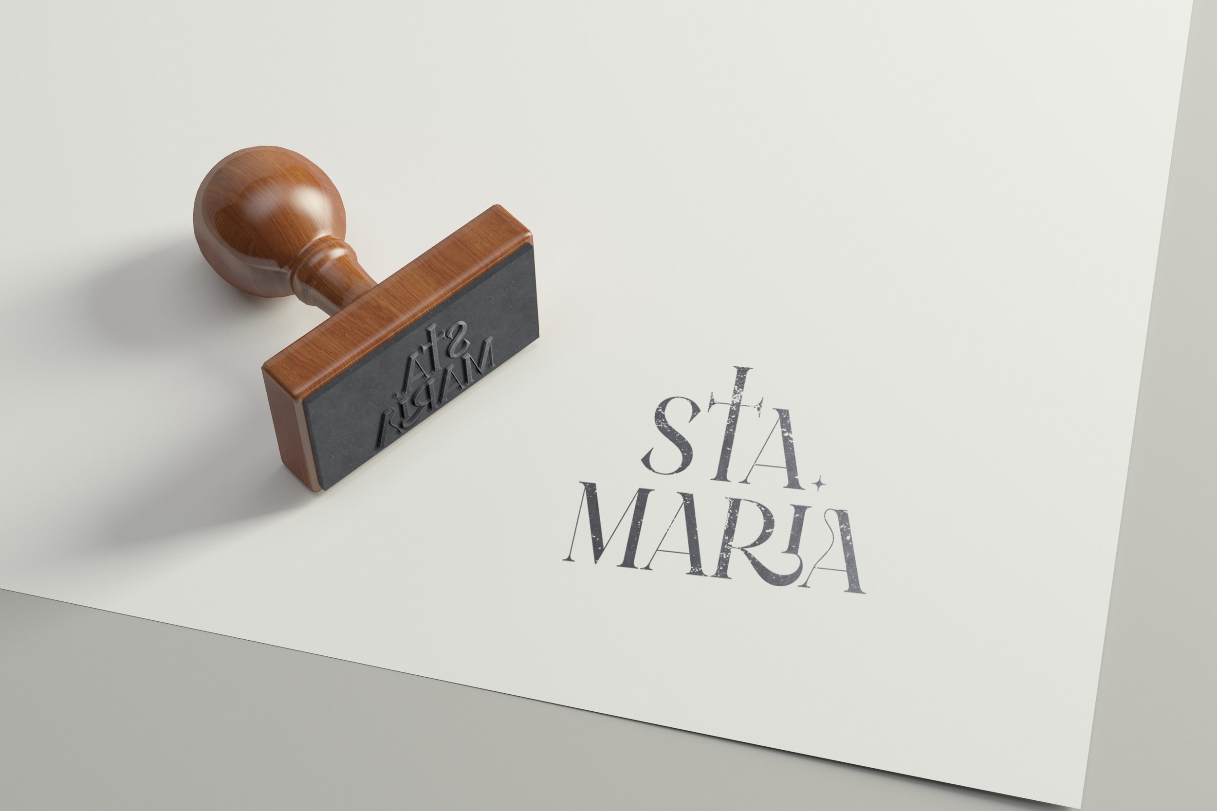
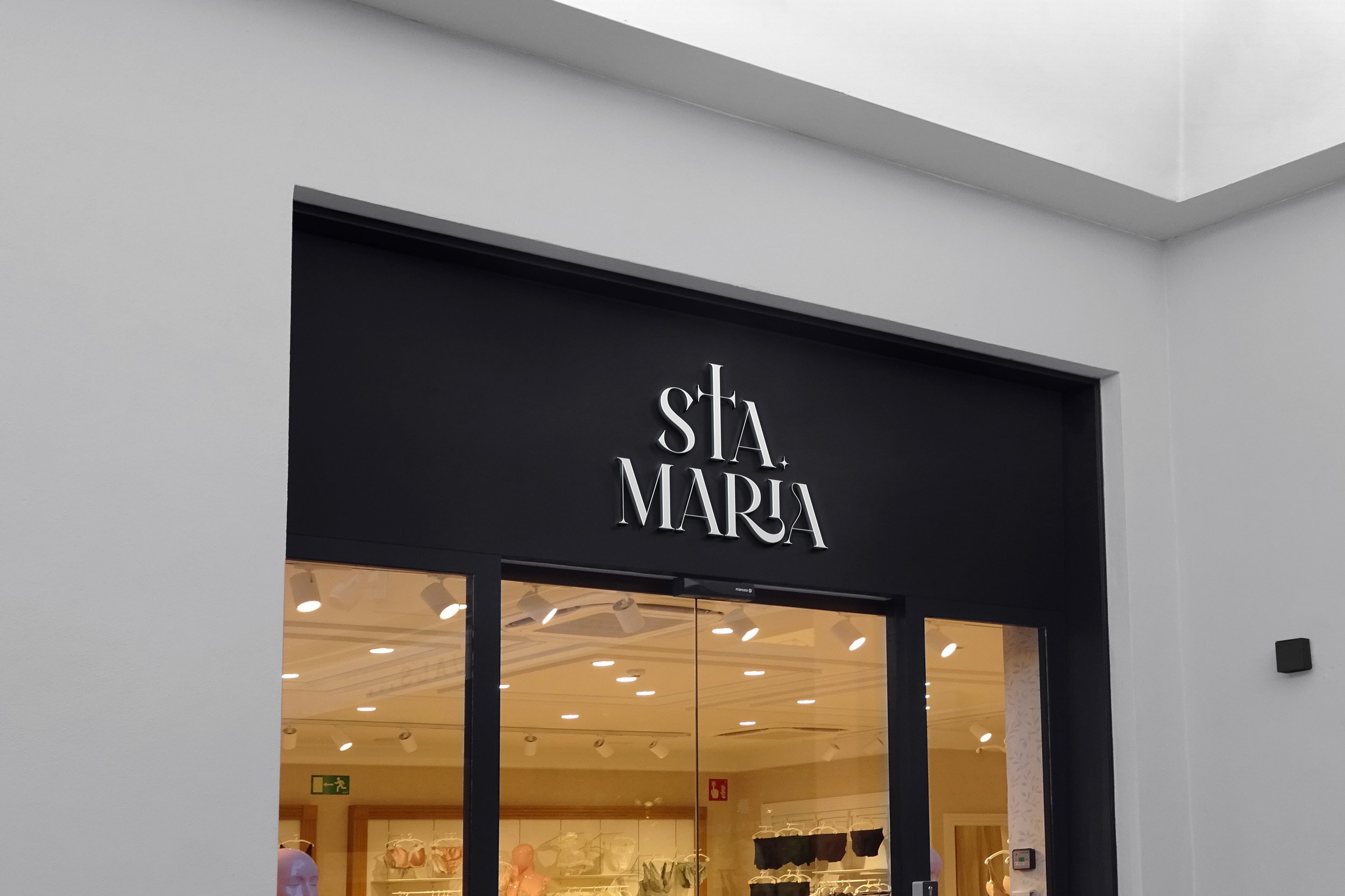
The logo design for 'STA MARIA' was conceptualized with a modern and minimalist aesthetic, focusing on the use of stylized typography. A font with unique cuts and angles was used to bring dynamism and elegance, making each letter feel sophisticated.
The cross symbol integrated into the 'T' adds a visual element that evokes tradition and personality, while the spaces between letters give the logo a clean, airy look. The end result is a logo that reflects a clothing brand with a contemporary, elegant approach and a distinctive touch.
Made in collaboration with SOTO BUSINESS PARTNERS.


